Final Evaluation
Final Evaluation
For '5 Moments in Wonderland' I chose 5 different fairytale stories with extraordinary worlds, where I created individual illustrations for each story in the book and created the final design, with a color palette and a suitable font for each story separately.
For the first work, I chose the "Little red riding hood" book, where I started working on illustrations digitally in Procreate. I wanted to make mute colored, dark and eerie background, where the only bright accent would be on the central and main figure Little red riding hood which is walking in the forest. In my opinion, the work turned out to be quite simple but suitable for a book that became recognisable and memorable. The choice of font was also not entirely simple. It was important for me to find and choose a font that would be attractive, readable, but also simple at the same time. The process of this work, was lengthy for me, since I have few strong skills in digital work, however, even so, I think that I coped with the main tasks and created decent work.
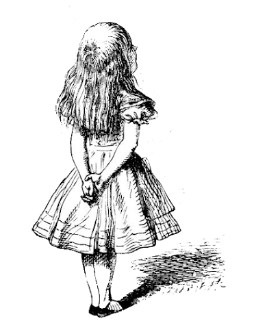
The second work, is the book cover for "Alice in Wonderland". For this work, I planned to create dreamy, pastel colored, magical cover. The idea for illustration was to recreate the famous scene from the story, which was when Alice drank from bottle that says "Drink Me”. and immediately got shrank in size and stuck inside of the bottle. For the font I found the one that in my opinion, suits the most for this story. To my mind, the expectations that I had for this cover became justified, I managed to recreate my idea properly, even though, the process was not simple and I spent a lot of time developing it. At the end of every work, I add the back cover in which there is the summary and annotation of each story of the book.
The third cover, is related to "Coraline". This book cover is more simple but at the same time eye-catching. For this I wanted to make something simple, with geometric figures, shapes and black-and-white colored cover. The main accent is on the hand of the character Other mother and the key to the parallel world that she is holding, which is framed in door lock shaped figure. For the font, I wanted to chose similar one to the original, which is eye catching and readable. The process of developing this work was slightly easier, however, if I had more time I would prefer to add more details and recreate it a little bit differently. In the back of the cover there is a description to the book, which lets individuals to read a brief annotation of the story.
For the fourth book cover, I chose the "Peter Pan" story. The plan for this illustration was to make simple, but magical cover with a bright accent to make it interesting. The accent is on the shadows of main characters, who are flying around in the night sky filled with stars and other details. The font is 'dreamlike', which suits to this book cover, in my opinion. This specific design took me not too long to make it, since I did not had enough time to work more on details. However, I think this book cover is successful, even though there are some unfinished moments that I wished to correct if I had more time. Back contains summary and annotation of the story.
Lastly, the final book is "The Wizard of Oz". To be completely honest, for this cover I did not had any specific idea on what illustration to create. The main points that I was considering were the balance, space and colors in the work that I mostly wanted to focus on. As I was running out of the time, I had no other choice than creating something extremely simple, and for that reason I did a tornado/storm that takes away the house. I chose the green color, since it is associating with the atmosphere of the story and is the main color of the book/logo. The font was chosen specifically suitable for this story, looking dreamy and elegant. Truthfully, I found this exact design least interesting and successful. I am sure that I am able to create something more extraordinary and original, however, short amount of time lead me to this design. Overall, the project was a helpful experience in improving our skills, exploring something new, learning more about softwares and gaining inspirations.


Comments
Post a Comment